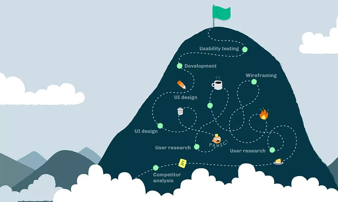
At the 2022 Open edX Conference I did a talk about a new OpenCraft project: designing a theme that will live up to the Open edX promise of “delivering inspiring learning experiences.” Recently I converted this talk into a blog post. It walks you through our UX and UI process - from the ups and downs, to the wins and losses.
Here’s a little excerpt…
–
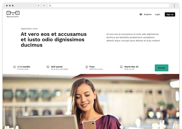
In our next attempt we envisioned a theme with two color options which users could modify if they wanted to. Here’s a sneak peak at the resulting design:
And with that, it was time to test the waters – we wanted to know how people felt about this new design direction. This is some of the feedback we received:
- Most test users found the design to be clean, modern, and professional.
- People didn’t love the color palettes
- Of the two options, the more neutral black and white palette was generally preferred.
- A few people showed interest in overriding the theme’s colors to match their branding.
- There were concerns over legibility, and whether the theme would pass accessibility checks if colors were changed.
- The sidebar navigation (which sticks-to-top) received good reviews, but many people were concerned about its contrast over different sections of the page, for example images and videos.
- Finally, test users didn’t like the border around the design.
This was great feedback! So we wiped the slate clean, yet again ![]() , and created a “light” and “dark” version of the theme. This will give users the choice of two neutral bases to work with.
, and created a “light” and “dark” version of the theme. This will give users the choice of two neutral bases to work with.
Here’s the top section of the “light” version of the theme:
Here’s what’s changed:
- The banner image is gone, and for good reason. First, if course creators have many courses, this takes away the burden of having to make multiple banner designs look good. Second, it differentiates this page from the theme’s homepage (which has a banner).
- We added a full-width image below the top content so course creators can have different images for different courses.
- We removed the sidebar navigation and went back to a horizontal sub-navigation that sticks-to-top to avoid contrast issues.
- For ease of use, the Like and Share buttons stick to the top of the screen as the user scrolls down.
- We added in a few more content sections like Course Info and What you’ll learn, so course creators have more opportunity to explain their course.
- We limited the height of even more sections, like About this course and Syllabus. Now the Syllabus section works well even if a course has lots of sections.
- We’ve also changed the design of the Testimonials and Instructors sections, so they work well even when there’s only one testimonial or one instructor.
- Finally, we’ve checked that the light and dark versions of the theme pass accessibility checks.
–
[Click here to read the full post, complete with lots of our design iterations!]
@jmakowski @abstract-technology @ProductRyan You guys might be interested!


